Put one of my best-performing emails into Flodesk Studio and here’s what happened…
← back to blog index
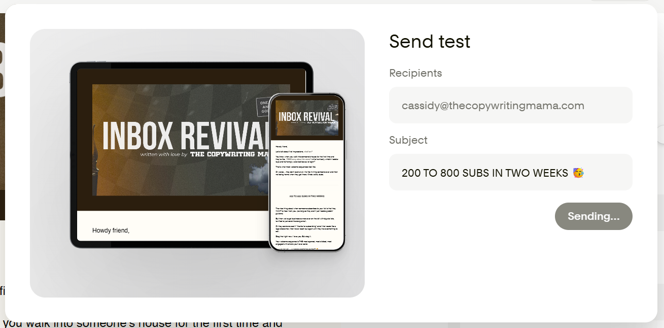
As a graphically challenged girlie, my emails have always ridden on my strength – the writing part. My typical newsletter looks like a Canva-made header, text heavy through the middle (with the occasional giphy sprinkled in), and a *super* simple footer.
It’s not that my emails are U-G-L-Y.
They’ve just left room for visual improvement. Flodesk, my heart ‘n soul Email Service Provider, recently rolled out Flodesk Studio. So I figured it’d be fun to take my handwriting and turn it into something far more aesthetically pleasing.
You down?? Sweet, stick with me.
My writing process is proprietary, so I showed up today with email copy in hand.
(hope you don’t mind)
Anyways, I pulled a slapper from October 2025. An email that, without Flodesk studio, got a 66.2% open rate, and a 1.1% click rate.

The click rate could’ve been better, but in my defense, the CTA at the time was “I’m booked up solid, but if you wanna work together soon, here’s my disco call link.”
It wasn’t exactly begging to be engaged with.
So we’ll switch it up this time.
I wanted to walk in with my copy already written so I could see what Studio does with the design side alone — no bells, no whistles, just ‘here’s my writing, make it pretty.’
Here’s the exact prompt I fed Flodesk Studio:
“Howdy, my right hand email designer. I’ve got the copywriting for you. Please don’t change a single word of it. Your only job here is to move this copy into an aesthetically pleasing format that jives with my brand. Here’s the copywriting for the email: [INSERT DOC WITH EMAIL COPY]”
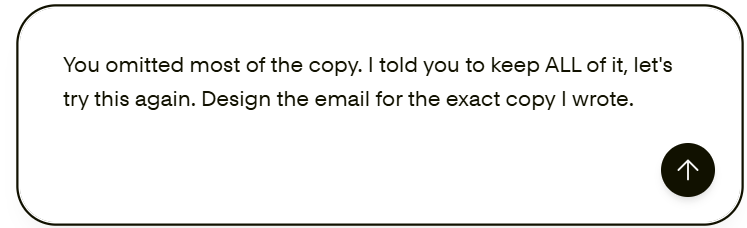
Okay… so the first try wasn’t perfect.
It was cute, but it was missing about half of the copy I fed it, so this is the response I entered.
Flodesk Studio always gives you 3 options: Design heavy, Design + text balanced, and text heavy.
I chose the middle, because it’s the closest to what I’m going for, but full transparency: it’s gonna need some editing. Which is why I’d consider this a design studio, not a magical email generator that requires no effort on your part.
It took me around 20 minutes to customize to my liking, and I did run into some hiccups (that I reported to the “share feedback” link at the bottom left corner of the window).
(Sidenote: Not sure why the test doesn’t come from my sender email, it appears to be sent from a no reply Flodesk email.)
Aside from the formatting spats (the ones I reported), the layout pieces add a nice touch. I can see where it’s easier on the eyes than just text alone. It’s also easier to skim!
As an ADHD girlie, I would be more likely to read it through like this than just using bold, italic, and sizing alone to separate large pieces of text.
Preview the email I created inside Flodesk Studio right here.
What surprised me about Flodesk Studio?
Ya know those AI-generated flyers going around where everybody with two brain cells to rub together knows they aren’t “real”?
These emails don’t give that. At all. And that’s because they’re not — not entirely, anyway. Real designers built the system that Studio runs on.
So what you’re getting is design that’s been accelerated, not just generated. That distinction matters when you’re someone like me whose brand voice is very specific and very… not-corporate. Lol.
Now if Flodesk is anything, they’re user friendly. Most of this program is intuitive, and they’ve been honest about the fact that they are building it (& pricing it) based on our beta experience.
That being said, did it design the entire thing for me? NOPE.
Was I even expecting it to, based on what I know about it? ALSO NOPE.
I knew I would need to go in and make it mine. But the starting point was miles ahead of what I could’ve built from a blank canvas alone.
Before you dive in, know this:
Flodesk Studio is currently free while it’s in beta.
If you’re wondering what it’ll cost after that — they’re using this period to figure that out. So right now, it’s nothing, and the perfect time to play around and see if it’s something you’ll use.
And hey, don’t worry if you’re not a Flodesk user, you can design in Studio and export the HTML to use with whatever email service provider you’re already on.
Does “design here, send anywhere” sound good to you? Me too.
(But if I’m bein’ honest, it’s soooo much easier to just hit “Share with Flodesk” and have it ready to hit send on without further ado.)
Flodesk Studio is NOT here to replace professional graphic designers.
What I can’t say is that Studio made me a graphic designer or eliminated my need for one entirely.
The feedback I submitted was real, and like any beta product, there are rough edges. But as someone who has spent years prioritizing copy over design because design felt inaccessible – this is the closest I’ve come to feeling like my emails match the quality of my writing.
That 20 minutes of editing would’ve looked like two hours in Canva piecing things together and still having to move it over into Flodesk. And it still wouldn’t have looked this good or been optimized for its job.
(To no fault of Canva’s, mind you, this just isn’t MY thing!)
Because looks are important, but functionality is KEY. Emails built in Flodesk Studio are already compliant. The sections are designed to render correctly in inboxes, not just look cute in editing.
As someone who has sent more than her fair share of ‘why does this look broken in Gmail’ oopsie emails, that’s a major time saver from going back and forth making tiny, tedious edits.
If you’ve been the “my emails are fine, they just look a little plain” girlie like me, take this email marketing design studio for a spin!
Pull up a past email you loved writing but wished looked better, and feed it to Studio. Give yourself 20 minutes, and let me know how it goes.
Your emails deserve to look as good as they sound. And if you ask me, Flodesk is your best shot at making that happen.
WARNING:
Joining this list will strengthen your email game, leaving you less reliant on social media to make sales.
subscribe to INBOX REVIVAL
Proceed with curiosity.
Name
Email address
